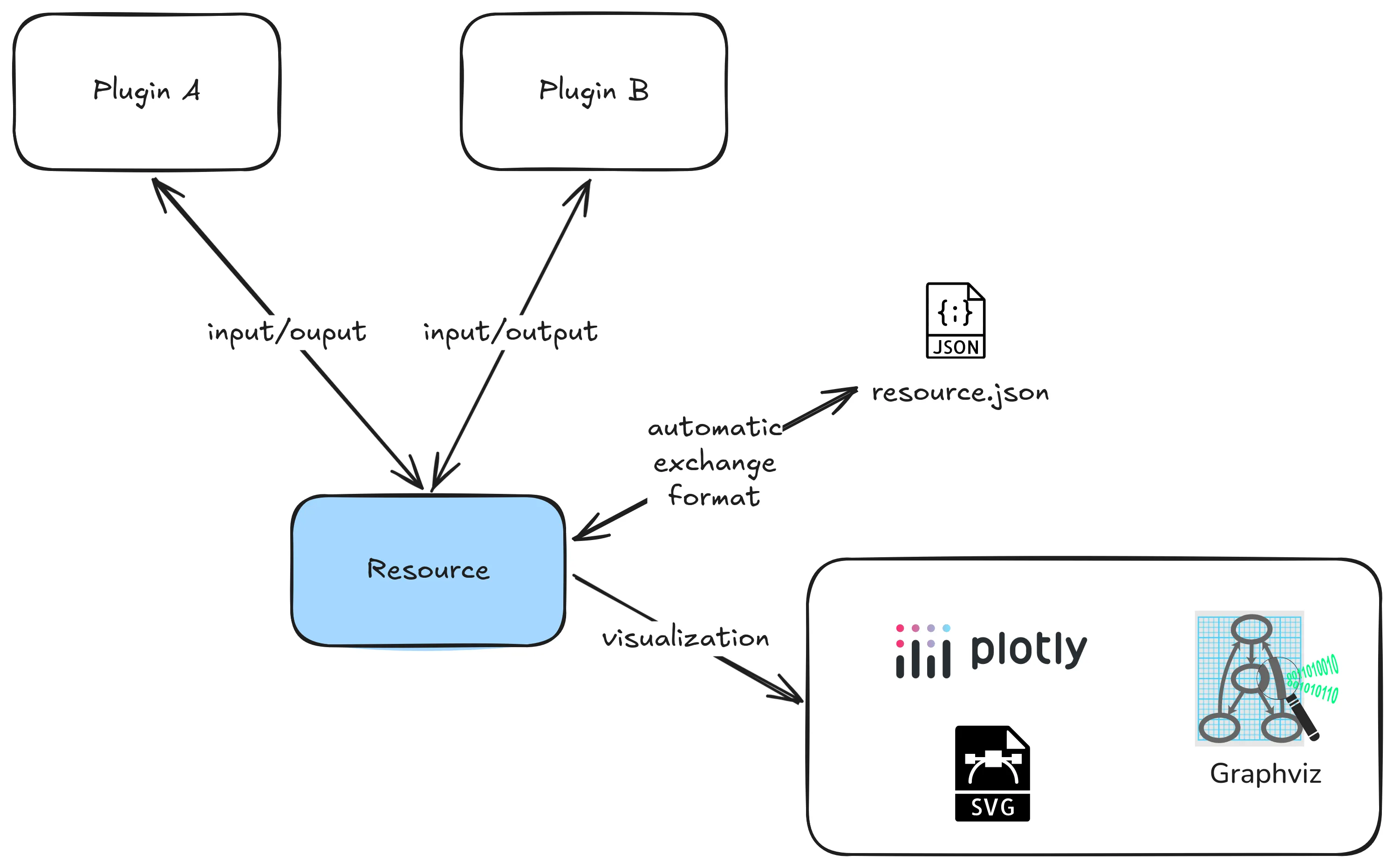
Resources
Resources are the main mechanism to define inputs and outputs of Ocelescope plugin methods.
When you define a resource, it becomes exportable and importable by default through an automatic exchange format.
Resources can also provide a visualization so they can be displayed in the frontend.
Defining a resource
Section titled “Defining a resource”Define a resource by creating a Python class that inherits from Resource (from the ocelescope package). The structure of the resource is described through typed fields on the class. You can also set label and description to control how the resource appears in the frontend.
If you want to reuse a resource across plugins, keep the class name and the field definitions identical.
from ocelescope import Resource
class Example(Resource):    label = "Example Resource"    description = "An example resource definition"
property_a: str property_b: list[int]Using resources in plugin methods
Section titled “Using resources in plugin methods”Ocelescope inspects the type hints of plugin methods. Resource types used as parameters are treated as resource inputs, and resource types used as the return type are treated as resource outputs and saved in the session for later use.
from ocelescope import Plugin, Resource, plugin_method
class MyResource(Resource):    label = "My Resource"    description = "Example resource"    value: int
class ExamplePlugin(Plugin):    label = "Example Plugin"    description = "Shows how resources are registered via type hints"    version = "1.0"
    @plugin_method(label="Increment resource")    def increment(self, x: MyResource) -> MyResource:        return MyResource(value=x.value + 1)
Visualizing resources
Section titled “Visualizing resources”Resources can provide a visualization so they can be displayed in the frontend. To do this, implement a visualize() method on your resource that returns one of the visualization classes provided by Ocelescope.
Overview
Section titled “Overview”| Class | Use case |
|---|---|
Graph | Interactive node/edge graph visualizations. |
DotVis | Rendering raw Graphviz DOT when you already have a DOT string. |
SVGVis | Render SVG markup. Useful when you generate SVG with another library (for example Matplotlib). |
Table | Displaying structured data as a typed table (rows + columns). |
Plotly | Interactive charts built with Plotly. |
Examples
Section titled “Examples”Basic graph example (Graph)
Section titled “Basic graph example (Graph)”Code
from ocelescope import Resourcefrom ocelescope.visualization.default.graph import (    Graph,    GraphEdge,    GraphNode,    GraphvizLayoutConfig,)
class GraphExample(Resource):    label = "Graph example (complex)"    description = "A connected graph that shows all node shapes with colorful edges."
    def visualize(self) -> Graph:        nodes = [            GraphNode(                id="n_circle",                label="circle",                shape="circle",                color="#A7F3D0",                border_color="#065F46",                label_pos="bottom",                width=20,                height=20,                rank="source",            ),            GraphNode(                id="n_triangle",                label="triangle",                shape="triangle",                color="#BFDBFE",                border_color="#1D4ED8",                label_pos="bottom",                width=20,                height=20,            ),            GraphNode(                id="n_rectangle",                label="rectangle",                shape="rectangle",                color="#FDE68A",                border_color="#92400E",                label_pos="center",                width=40,                height=50,            ),            GraphNode(                id="n_diamond",                label="diamond",                shape="diamond",                color="#FBCFE8",                border_color="#9D174D",                label_pos="bottom",                width=40,                height=40,            ),            GraphNode(                id="n_hexagon",                label="hexagon",                shape="hexagon",                color="#DDD6FE",                border_color="#5B21B6",                label_pos="top",                width=30,                height=30,                rank="sink",            ),        ]
        edges = [            GraphEdge(                source="n_circle",                target="n_triangle",                label="circle → triangle",                color="#EF4444",                start_arrow=None,                end_arrow="triangle",            ),            GraphEdge(                source="n_triangle",                target="n_rectangle",                label="triangle → rectangle",                color="#F59E0B",                start_arrow="circle",                end_arrow="chevron",            ),            GraphEdge(                source="n_rectangle",                target="n_diamond",                label="rectangle → diamond",                color="#10B981",                start_arrow="tee",                end_arrow="vee",            ),            GraphEdge(                source="n_diamond",                target="n_hexagon",                label="diamond → hexagon",                color="#3B82F6",                start_arrow="square",                end_arrow="diamond",            ),            GraphEdge(                source="n_hexagon",                target="n_circle",                label="hexagon → circle",                color="#8B5CF6",                start_arrow="triangle-cross",                end_arrow="circle-triangle",            ),        ]
        return Graph(            nodes=nodes,            edges=edges,            layout_config=GraphvizLayoutConfig(                engine="dot",                graphAttrs={"rankdir": "LR", "nodesep": 1, "ranksep": 1},            ),        )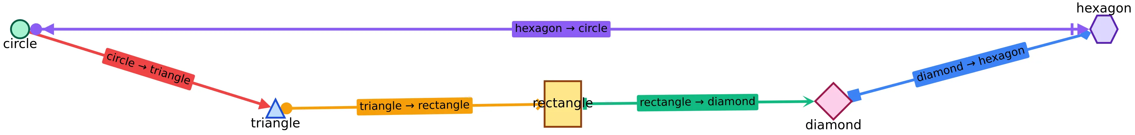
SVG through markup (SVGVis)
Section titled “SVG through markup (SVGVis)”Code
from ocelescope import Resourcefrom ocelescope.visualization.default.svg import SVGVis
class MyRawSVGResource(Resource):    label = "SVG example (raw markup)"    description = "Render raw SVG markup."
    def visualize(self) -> SVGVis:        svg = """        <svg xmlns="http://www.w3.org/2000/svg" width="420" height="140">          <rect x="10" y="10" width="400" height="120" rx="10" fill="#f3f4f6"/>          <text x="25" y="40" font-size="18" fill="#111827">SVGVis demo</text>
          <circle cx="70" cy="85" r="22" fill="#f59e0b"/>          <rect x="120" y="65" width="80" height="40" rx="6" fill="#60a5fa"/>          <polygon points="250,105 230,65 270,65" fill="#34d399"/>
          <text x="310" y="92" font-size="14" fill="#374151">Raw SVG markup</text>        </svg>        """        return SVGVis(svg=svg)
SVG through Matplotlib (SVGVis)
Section titled “SVG through Matplotlib (SVGVis)”Code
import io
from ocelescope import Resourcefrom ocelescope.visualization.default.svg import SVGVis
class MyMatplotlibSVGResource(Resource):    label = "SVG example (Matplotlib)"    description = "Generate SVG with Matplotlib and render it."
    def visualize(self) -> SVGVis:        # Keep the import inside the method so the plugin still loads        # even if Matplotlib is not installed.        try:            import matplotlib.pyplot as plt        except ImportError:            return SVGVis(                svg="""                <svg xmlns="http://www.w3.org/2000/svg" width="520" height="80">                  <rect x="10" y="10" width="500" height="60" rx="10" fill="#FEF3C7"/>                  <text x="25" y="48" font-size="14" fill="#92400E">                    Matplotlib is not installed in this environment.                  </text>                </svg>                """            )
        fig, ax = plt.subplots()        ax.plot([0, 1, 2], [0, 1, 0], marker="o")        ax.set_title("Matplotlib SVG demo")
        buffer = io.StringIO()        fig.savefig(buffer, format="svg", bbox_inches="tight")        plt.close(fig)
        return SVGVis(svg=buffer.getvalue())
Table (Table)
Section titled “Table (Table)”Code
from ocelescope import Resourcefrom ocelescope.visualization.default.table import Table, TableColumn
class MyTableResource(Resource):    label = "Table example"    description = "Display structured data as a typed table."
    def visualize(self) -> Table:        return Table(            columns=[                TableColumn(id="name", label="Name", data_type="string"),                TableColumn(id="age", label="Age", data_type="number"),                TableColumn(id="member", label="Is member", data_type="boolean"),                TableColumn(id="joined", label="Join date", data_type="date"),            ],            rows=[                {"name": "Alice", "age": 30, "member": True, "joined": "2022-01-15"},                {"name": "Bob", "age": 25, "member": False, "joined": "2023-06-10"},                {"name": "Charlie", "age": 40, "member": True, "joined": "2021-09-20"},            ],        )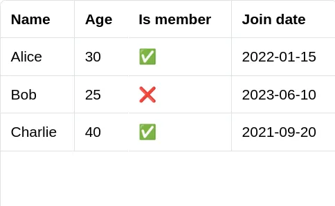
Dot (DotVis)
Section titled “Dot (DotVis)”Code
from graphviz import Digraph
from ocelescope import Resourcefrom ocelescope.visualization.default.dot import DotVis
class MyDotResource(Resource):    label = "DotVis example"    description = "Render a Graphviz DOT diagram."
    def visualize(self) -> DotVis:        dot = Digraph()        dot.attr(rankdir="LR")
        dot.node("A", "Start", shape="circle")        dot.node("B", "Work", shape="box")        dot.node("C", "End", shape="doublecircle")
        dot.edge("A", "B", label="go")        dot.edge("B", "C", label="finish")
        return DotVis.from_graphviz(            graph=dot,            layout_engine="dot",        )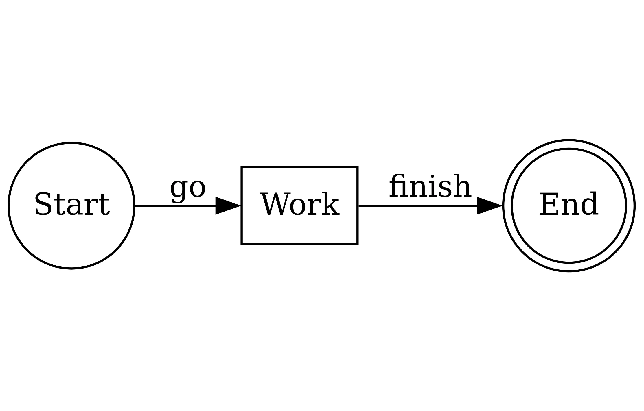
Plotly (Plotly)
Section titled “Plotly (Plotly)”Code
import plotly.graph_objects as go
from ocelescope import Resourcefrom ocelescope.visualization.default.plotly import Plotly
class PlotlyExample(Resource):    label = "Plotly example"    description = "Interactive charts built with Plotly."
    def visualize(self) -> Plotly:        x = list(range(1, 13))        y = [2, 4, 3, 6, 8, 7, 9, 11, 10, 13, 14, 16]
        fig = go.Figure()
        fig.add_trace(            go.Scatter(                x=x,                y=y,                mode="lines+markers",                name="Signal",                line=dict(width=4, shape="spline"),                marker=dict(size=10),                hovertemplate="Month %{x}<br>Value %{y}<extra></extra>",            )        )
        fig.add_hrect(            y0=9,            y1=12,            line_width=0,            fillcolor="lightgreen",            opacity=0.25,            annotation_text="Target range",            annotation_position="top left",        )
        fig.add_annotation(            x=x[-1],            y=y[-1],            text="Peak",            showarrow=True,            arrowhead=3,            ax=-30,            ay=-40,        )
        fig.update_layout(            title="Flashy Plotly demo",            template="plotly_dark",            height=420,            margin=dict(l=40, r=20, t=60, b=40),            legend=dict(                orientation="h",                yanchor="bottom",                y=1.02,                xanchor="right",                x=1,            ),        )
        fig.update_xaxes(title="Month", showgrid=False)        fig.update_yaxes(title="Value", zeroline=False)
        return Plotly(figure=fig)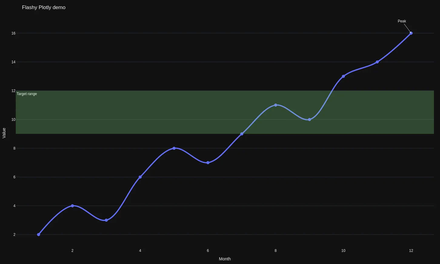
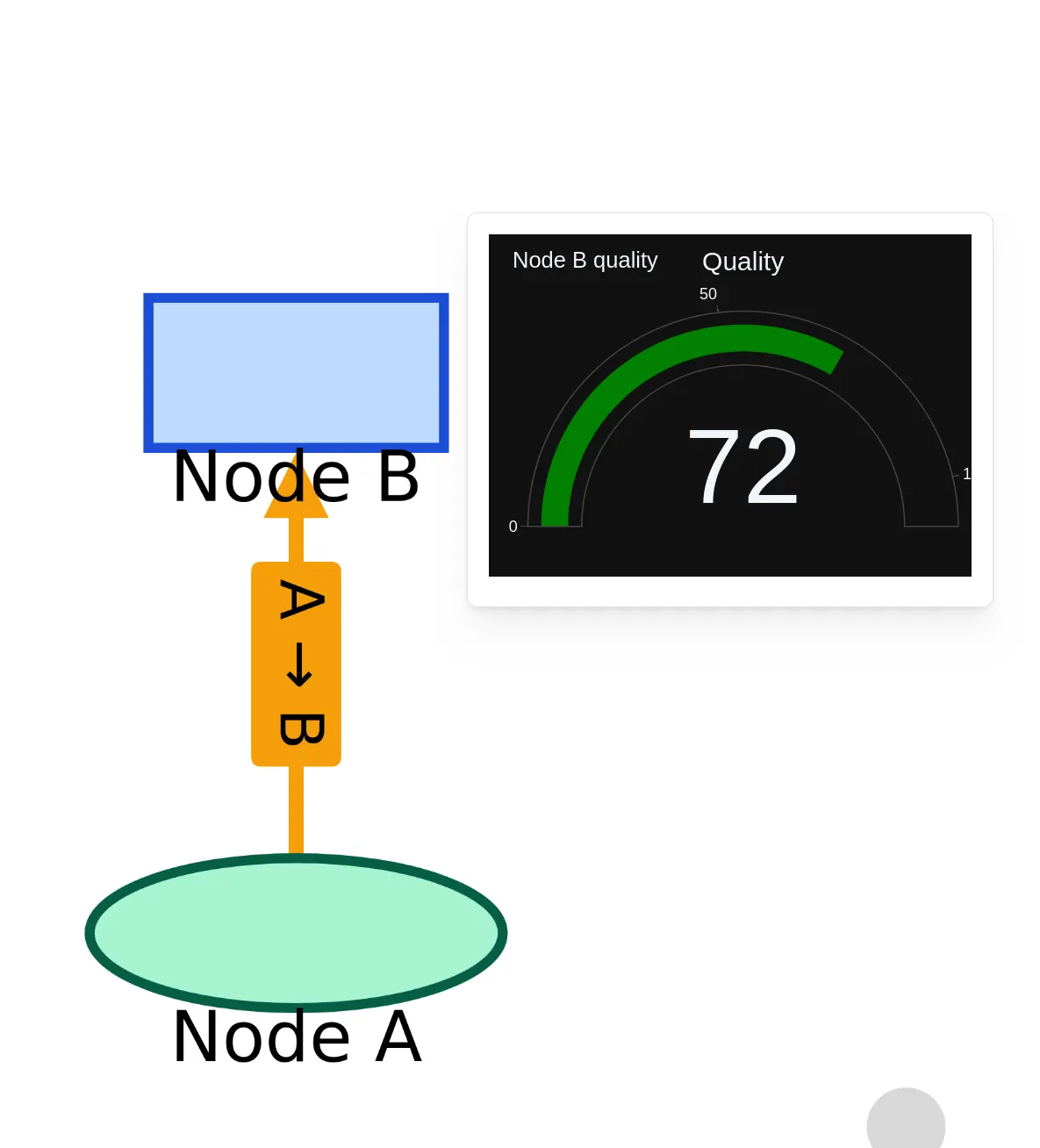
Graph with annotations (Graph)
Section titled “Graph with annotations (Graph)”You can annotate Graph nodes and edges with other visualizations, which the frontend can open when the user clicks the node or edge.
Code
import plotly.graph_objects as go
from ocelescope import Resourcefrom ocelescope.visualization.default.graph import Graph, GraphEdge, GraphNode, GraphvizLayoutConfigfrom ocelescope.visualization.default.plotly import Plotly

class InteractiveGraphExample(Resource):    label = "Graph example (interactive annotations)"    description = "A graph where nodes/edges have Plotly annotations."
    def visualize(self) -> Graph:        # Node A annotation        fig_a = go.Figure(            data=[go.Bar(x=["Queued", "Running", "Done"], y=[3, 1, 8])],        )        fig_a.update_layout(            title="Node A stats",            template="plotly_dark",            height=260,            margin=dict(l=30, r=10, t=50, b=30),        )
        # Node B annotation        fig_b = go.Figure(            data=[go.Indicator(mode="gauge+number", value=72, title={"text": "Quality"})],        )        fig_b.update_layout(            title="Node B quality",            template="plotly_dark",            height=260,            margin=dict(l=30, r=10, t=50, b=30),        )
        # Edge annotation        fig_edge = go.Figure(            data=[go.Scatter(x=[1, 2, 3, 4, 5], y=[2, 3, 2, 4, 6], mode="lines+markers")],        )        fig_edge.update_layout(            title="Edge throughput",            template="plotly_dark",            height=260,            margin=dict(l=30, r=10, t=50, b=30),        )
        return Graph(            nodes=[                GraphNode(                    id="A",                    label="Node A",                    shape="circle",                    color="#A7F3D0",                    border_color="#065F46",                    label_pos="bottom",                    annotation=Plotly(figure=fig_a),                ),                GraphNode(                    id="B",                    label="Node B",                    shape="rectangle",                    color="#BFDBFE",                    border_color="#1D4ED8",                    label_pos="bottom",                    annotation=Plotly(figure=fig_b),                ),            ],            edges=[                GraphEdge(                    source="A",                    target="B",                    label="A → B",                    color="#F59E0B",                    end_arrow="triangle",                    annotation=Plotly(figure=fig_edge),                )            ],            layout_config=GraphvizLayoutConfig(engine="dot"),        )